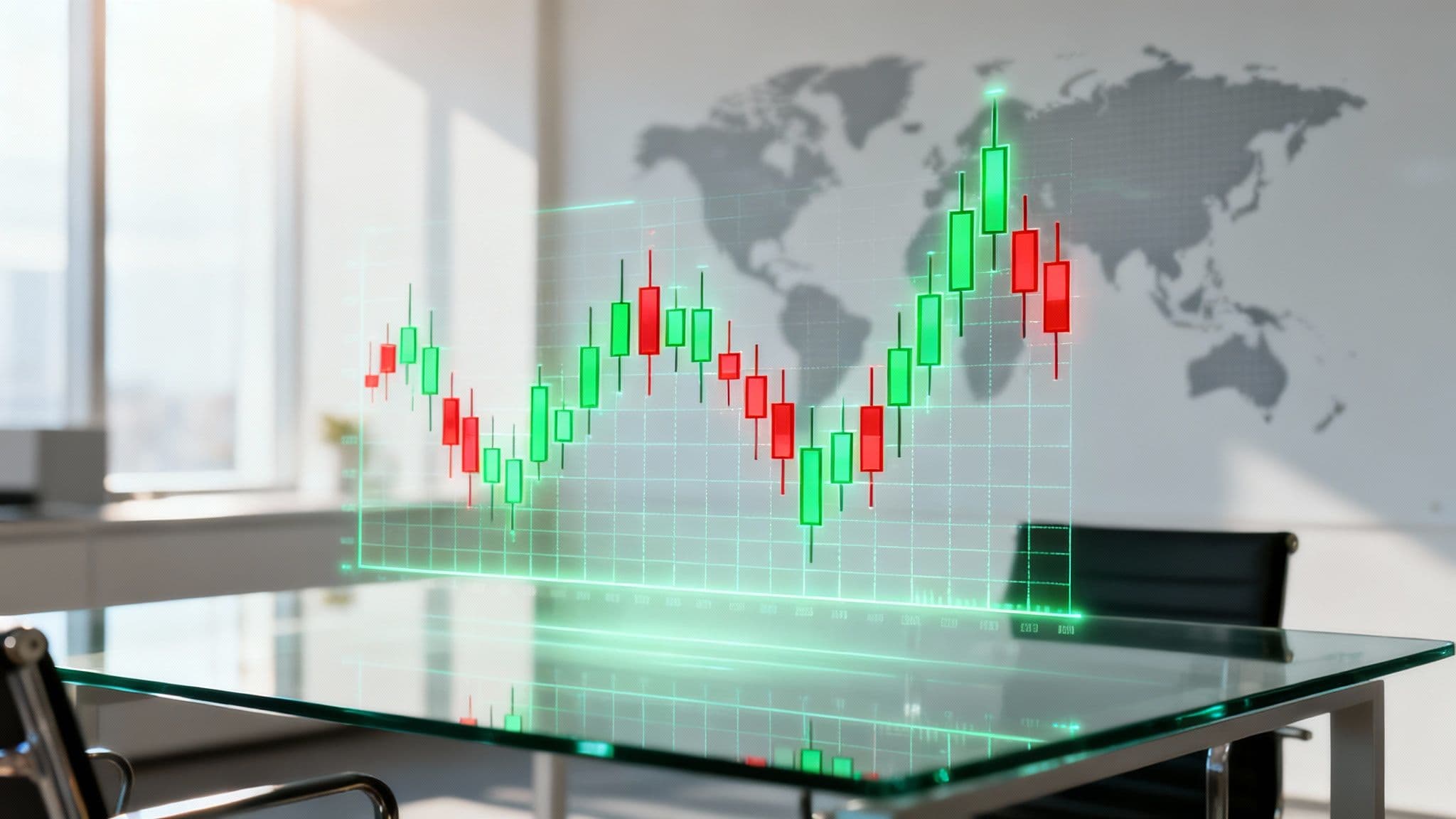
For any South African business leader, navigating the global currency market can often feel like trying to predict the weather. The forex candlestick chart is your most reliable narrator in this complex world, giving you a visual snapshot of the tug-of-war between buyers and sellers for currency pairs like the USD/ZAR—far more effectively than a simple line graph ever could.
Unlocking the Story of the Forex Market
Think of each candle on the chart as a mini-chapter in the market's ongoing story, packed with clues about sentiment and momentum. This guide is designed for South African businesses that need to get a handle on currency risk by interpreting these visual signals. We’ll show you how to read what each candle is telling you, spot patterns that hint at potential shifts in the rand, and use this insight to protect your bottom line.
Getting comfortable with these charts means you can time international payments and receipts with far greater confidence, helping you lock in the best possible exchange rates. It’s about shifting from a reactive approach to currency management to a proactive strategy driven by real market data.
Why Candlestick Charts Matter for the Rand
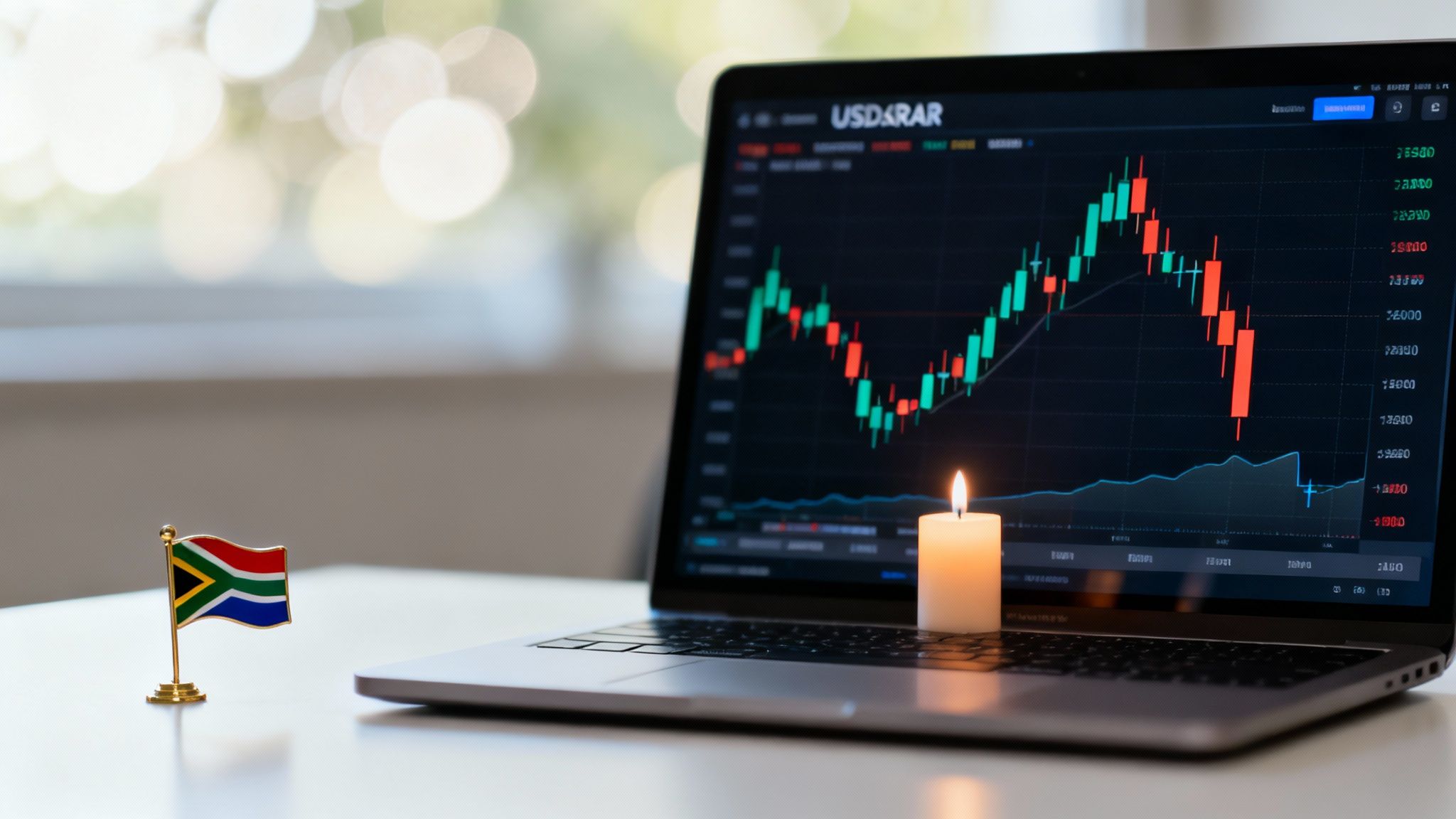
Recent market volatility puts their value into sharp focus. The South African Rand (ZAR) has shown incredible resilience lately, even marking its best performance in over 15 years. Over the last 12 months, the USD/ZAR pair has dropped by 12.65%, a clear sign of the rand's steady recovery from its all-time high of 19.93.
This entire trading range, from a low of 16.3001 to that peak of 19.9350, creates critical support and resistance levels. These are the very lines that finance teams can see on candlestick charts and use to build their risk management strategies.
For a CFO, reading a candlestick chart isn't just a technical exercise; it's about turning market sentiment into solid financial strategy. A string of strong green candles might signal the ideal time to bring foreign earnings home, while a series of bearish patterns could be the trigger to hedge against a weakening rand.
To truly master the stories these charts tell, it's also essential to consider the best time frames for trading, as a daily chart tells a very different story from an hourly one. Combining sharp pattern recognition with the right time horizon is the foundation for making sound financial decisions that benefit your business.
The Four Key Parts of a Forex Candlestick
Every candlestick you see on a forex chart tells a story. It’s a visual summary of the tug-of-war between buyers and sellers over a specific period, whether that's one hour, four hours, or a full day. To make sense of it all, you just need to understand its four key parts.
Think of it this way: each candle is made up of a body and its wicks. Let's break them down.
The Body: The Story of the Open and Close
The thick, solid part of the candle is its real body. This is the heart of the action, showing you precisely where a currency pair's price opened and where it closed for that timeframe.
The colour of the body instantly tells you who was in control:
- A green (or sometimes white) body means the closing price was higher than the opening price. This is a bullish sign. It shows that buyers had the upper hand, pushing the price up during that session.
- A red (or sometimes black) body means the closing price was lower than the opening price. This is a bearish signal, telling you that sellers were in charge, driving the price down.
A long body indicates strong, decisive pressure in one direction, whereas a short, squat body suggests the market is pausing for breath or feeling indecisive. This single visual cue on a USD/ZAR chart gives you an immediate sense of market momentum.
The Wicks: The Highs and Lows of the Session
Sticking out from the top and bottom of the body are two thin lines. These are called wicks, though some traders refer to them as shadows. These wicks map out the full trading range for the period.
The very top of the upper wick shows the highest price reached during the session. The bottom of the lower wick marks the lowest price hit.
The length of the wicks gives you vital clues about market sentiment. For example, a long upper wick on a green candle suggests buyers tried to push the price much higher, but sellers fought back and pushed it down before the session closed. This could be an early warning sign that the buyers are losing steam.
By looking at the body and the wicks together, you get a full picture of the market’s psychology. This simple four-part structure—open, close, high, and low—is the language of the market, turning a flat price chart into a rich story of supply and demand.
To help you remember what each part means, here’s a quick reference table. Think of it as your cheat sheet for understanding the core message of any candle you see on the charts.
Reading a Candlestick at a Glance
| Candlestick Component | What It Tells You | Business Implication for USD/ZAR |
|---|---|---|
| Green/White Body | The closing price was higher than the opening price. Buyers are in control. | The Rand weakened against the Dollar during this period. Bad news for importers. |
| Red/Black Body | The closing price was lower than the opening price. Sellers are in control. | The Rand strengthened against the Dollar. Good news for importers. |
| Long Body | Strong buying or selling pressure; a decisive move. | High conviction in the market—the ZAR is moving strongly in one direction. |
| Short Body | Little price movement; indecision or consolidation. | The market is uncertain. The USD/ZAR rate could be preparing for its next move. |
| Upper Wick | Shows the session’s high; how far buyers managed to push the price up. | Represents the highest rate an exporter could have theoretically achieved. |
| Lower Wick | Shows the session’s low; how far sellers managed to push the price down. | Represents the lowest rate an importer could have theoretically achieved. |
Looking at these components together helps you move beyond just seeing a price. You start to understand the story behind that price, which is the first step toward making more informed forex decisions for your business.
Candlestick Patterns Every Business Leader Should Know
A single candle gives you a decent snapshot, but the real story unfolds when you see them cluster together. These combinations, or patterns, reveal a lot about the market's mood. For a South African CFO tracking the USD/ZAR rate, these recurring shapes are gold. Think of them as early warning signals, hinting at whether a trend is solidifying or about to run out of steam.
It's less about memorising dozens of weirdly named patterns and more about understanding the story they tell. Each one is a mini-drama about the tug-of-war between buyers and sellers. By learning to spot who’s winning that fight, you can anticipate shifts that directly impact your bottom line.
Bullish Patterns Signalling a Stronger Rand
When you spot a bullish pattern, it suggests the sellers are losing their grip. This could mean the USD is about to weaken against the ZAR—great news for importers. Seeing one of these form might signal the perfect time to settle those international invoices, as your rands will suddenly stretch a lot further.
- Bullish Engulfing: This is a powerful two-candle signal. It happens when a big green candle completely swallows the body of the smaller red one before it. The story here is clear: after a period of selling, the buyers came back with a vengeance, wiped out the previous day's losses, and showed they mean business. It often points to a potential rally for the ZAR.
- The Hammer: Picture this: the market tries to push the ZAR weaker (a higher USD/ZAR price), but buyers refuse to let it happen. They fight back hard. The result is a candle with a small body at the top and a long tail, or "wick," below. This Hammer shows that despite the selling pressure, buyers hammered the price right back up, hinting that a floor might have just been set.
Bearish Patterns Warning of a Weaker Rand
On the flip side, bearish patterns suggest the buyers are getting tired. The USD might be about to strengthen against the ZAR. For an exporter sitting on dollar revenues, these patterns are a critical heads-up to convert those funds before the exchange rate turns against you.
- Bearish Engulfing: As you’d guess, this is the exact opposite of the bullish version. A huge red candle completely wraps around the smaller green one before it. It’s a decisive signal that sellers have seized control, often kicking off a period of ZAR weakness.
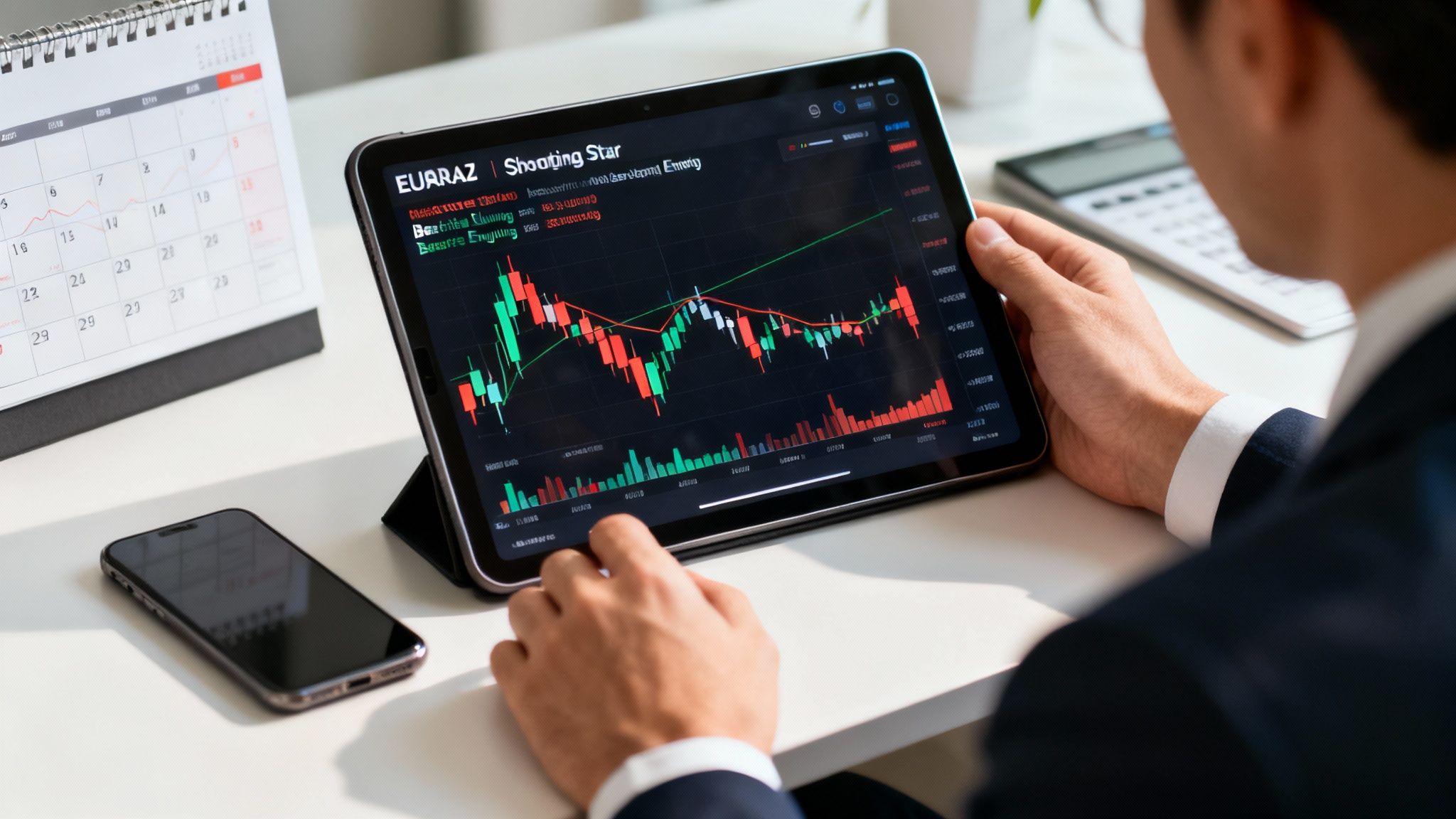
- The Shooting Star: This candle has a small body at the bottom with a long wick stretching upwards. It shows that buyers tried to push the price higher, but sellers slapped them back down with force. This Shooting Star, falling from its peak, is a strong warning that the upward run is losing momentum fast.
This diagram breaks down the basic anatomy of any candle—the body and wicks—which are the building blocks for all of these patterns.
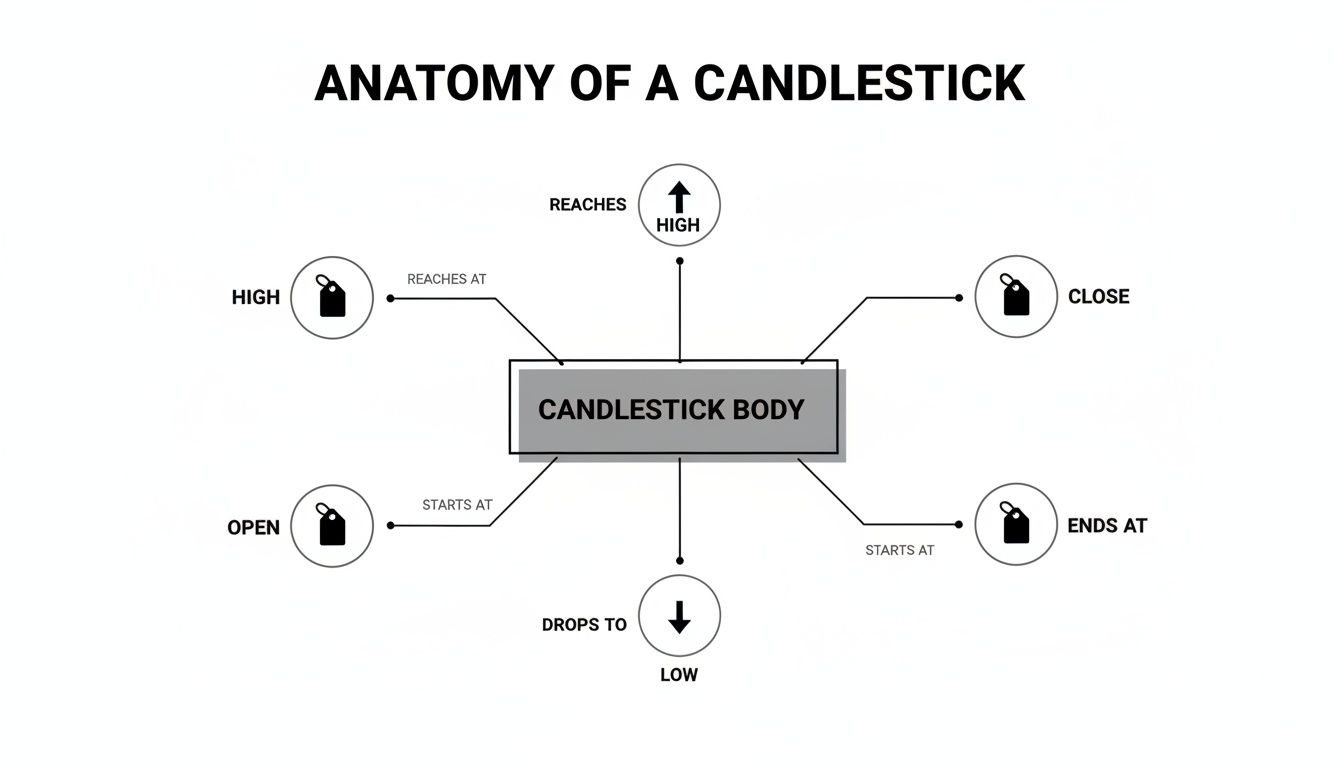
Ultimately, how the open, close, high, and low prices relate to each other is what creates these distinct shapes and tells us what the market is thinking.
A crucial pattern that screams "indecision" is the Doji. This candle looks more like a cross than a rectangle because its open and close prices are almost identical, leaving it with a tiny body. When a Doji appears after a strong trend, it’s like a flashing yellow light—it signals the market is exhausted and a reversal could be just around the corner.
Learning to spot these key formations on a forex candlestick chart elevates your financial strategy from simply reacting to proactively planning. It empowers you to make sharp, timely decisions on currency conversions, turning technical analysis into a real competitive advantage.
Tying Chart Patterns to the Realities on the Ground in South Africa
A candlestick chart for the USD/ZAR isn't just a collection of abstract shapes; it's the market's live reaction to what’s happening in the South African economy. Think of it this way: the chart patterns—the hammers, the doji, the engulfing candles—tell you what is happening with the price. The economic news explains why it's happening.
For any South African business dealing in foreign currency, connecting these two worlds is everything. A strong bullish pattern on the chart means so much more when it lines up with good news, like an unexpected jump in our trade surplus or rising prices for the commodities we export. Without that real-world context, you're just guessing, potentially mistaking temporary market noise for a genuine trend.
Why Fundamentals Drive the Charts
Big economic announcements are the fuel for major price moves. When the South African Reserve Bank (SARB) decides to hike interest rates, for example, it tends to pull in foreign investment from those chasing better returns. This rush of demand for the ZAR doesn't just happen in theory; you see it on the chart as a series of strong, decisive green candles pushing the USD/ZAR rate down.
On the other hand, bad news like a credit rating downgrade or whispers of political instability can cause capital to flee. On the chart, this might look like a cascade of long red candles, maybe even forming a bearish engulfing pattern that screams "more rand weakness ahead." Getting a feel for this cause-and-effect relationship is the first step to mastering these charts.
A candlestick pattern is like a footprint in the sand; it shows where the market has been. South African economic data is like the tide; it tells you in which direction the footprints are likely to head next.
By keeping one eye on the charts and the other on the economic calendar, a CFO can start to see the difference between a minor market wobble and a real, fundamentally-driven shift. That insight is gold when you're trying to time a large international payment or bring export revenue back home at the best possible rate.
The Bigger Economic Picture
The power of any chart signal is also directly tied to the broader macroeconomic environment. Things like South Africa's trade balance and foreign exchange reserves give you crucial context for the rand's underlying strength and potential for big swings.
For instance, the country’s gross foreign exchange reserves recently hit a record high of USD 72.07 billion. A healthy buffer like that gives the central bank a lot of firepower to step in and stabilise the currency if needed. This makes sudden, dramatic bearish patterns less probable unless there's a serious catalyst. For a finance team looking at candlestick charts, knowing this fundamental fact helps explain why the rand might be showing resilience. You can find more detail in the latest research on South Africa's currency reserves.
Ultimately, a forex candlestick chart becomes a far more powerful tool when you view it through the lens of South Africa’s economic reality. It stops being a set of abstract patterns and turns into genuine, actionable intelligence that can help your business navigate the forex market with far more confidence.
Putting Candlestick Analysis Into Action
Reading the theory is one thing, but translating what you see on a forex candlestick chart into a decisive business move is where the real value is unlocked. Let's walk through a practical scenario to see exactly how this works.
Picture this: you're the finance manager for a South African fruit exporter. A payment of €100,000 is due from a European client, and you're watching the EUR/ZAR exchange rate like a hawk. Your goal is simple: get the most rands you possibly can for those euros.
You’ve seen the EUR/ZAR rate climbing nicely—which is great news for you—but it's now getting dangerously close to a known resistance level. This is a price ceiling where past upward trends have run out of steam and reversed.
From Chart Pattern to Financial Decision
As the rate inches towards this critical point, a specific candlestick pattern catches your eye: a 'Shooting Star'. This is a classic bearish signal. Its long upper wick tells a story: buyers tried to push the price higher during the session, but sellers fought back hard and slammed it back down. The market’s upward momentum is showing clear signs of exhaustion.
The next day, your suspicion is confirmed. A big, bold red candle appears, completely swallowing the body of the previous day's smaller green candle. This is the unmistakable 'Bearish Engulfing' pattern—a powerful sign that sellers have wrestled control from the buyers.
The combination of a Shooting Star right at a resistance level, followed immediately by a Bearish Engulfing pattern, is a high-probability signal. It’s the chart’s way of shouting that the euro's rally against the rand is likely over and a downward slide is on the cards.
Based on this clear, visual evidence, you decide to act. No more waiting. You lock in the currency conversion right then and there, securing the favourable rate before the anticipated drop materialises. If you had waited, that €100,000 could have been worth significantly fewer rands by the time the EUR/ZAR rate fell.
This is how a forex candlestick chart becomes more than just an analytical tool. It transforms into a proactive risk management asset, giving you the confidence to make data-driven decisions that directly protect your company's bottom line. By learning to read the story the candles tell, you move from just reacting to market shifts to anticipating them—and that’s how you secure real, tangible financial gains. This is the practical power of mastering candlestick analysis.
Putting It All Together: From Charts to a Modern FX Strategy
A forex candlestick chart is an incredible tool, but it’s not a crystal ball. Think of it as one part of your navigation system, not the entire thing. Relying on chart patterns alone is risky; their real power comes alive when you combine their signals with a disciplined, modern financial workflow.
The great news is that candlestick analysis has become more reliable than ever. With the shift to electronic trading platforms, we now have access to high-quality, transparent data that makes these patterns truly meaningful. This is a world away from the old days, where opaque pricing from banks could easily paint a distorted picture of the market.
From Analysis to Action
So, how do you bridge the gap between spotting a pattern on a chart and actually securing that rate? This is where modern fintech solutions come in. They give you a direct window into the real, live exchange rates that form the very candles you're analysing. This allows you to sidestep the wide spreads and hidden markups that often get baked into traditional bank quotes.
When a chart signals it's the right time to pull the trigger, you can act on that exact rate with confidence.
South Africa's own forex market is a perfect example of this shift. The market is on track to hit USD 6,852.50 million by 2033, a growth spurt fuelled largely by the move to electronic dealing. This transition has done two crucial things: it's lowered transaction costs and boosted liquidity, making the patterns you see on a ZAR/USD forex candlestick chart more dependable than ever before. For a business, this means the rates shown on the chart are now genuinely within reach. You can dig deeper into the growth of South Africa's FX market here.
A winning FX strategy doesn't stop at spotting a pattern. It's about having clear rules of engagement: what signal prompts you to act, what other indicator needs to confirm it, and crucially, what is your stop-loss if the market turns against you?
Ultimately, weaving candlestick analysis into your strategy is about making every decision informed and data-driven. It turns chart-reading from a passive observation into an active part of your risk management framework. You're no longer just watching the market—you're strategically engaging with it.
Frequently Asked Questions
When you're first getting to grips with candlestick charts, a few practical questions always come up. Here are some straightforward answers to the most common queries we hear from business leaders, designed to help you confidently apply chart analysis to your financial strategy.
Which Chart Timeframe Is Best for Business Payments?
For big-picture decisions—like timing a large international supplier payment or bringing revenue back to South Africa—the daily (D1) and 4-hour (H4) charts are your best friends. The daily chart cuts through the noise and shows you the major trend, along with critical support and resistance levels. Think of it as your strategic map.
The 4-hour chart then acts as your tactical guide, helping you zoom in to pinpoint a solid entry point within that broader daily trend. This two-pronged approach helps you make well-timed decisions without getting bogged down by the minute-by-minute fluctuations that only matter to full-time day traders.
Should I Rely Only on Candlestick Patterns?
Definitely not. While candlestick patterns are fantastic for gauging market sentiment, they're not a crystal ball. Their signals become far more powerful and reliable when you use them as part of a complete analytical toolkit.
The smartest move is to combine your chart analysis with the fundamental factors that actually drive the rand. This means keeping a close watch on South African economic news, announcements from the SARB, and global commodity price shifts. Blending the technical (charts) with the fundamental (news) gives you a much clearer and more reliable picture for making your financial decisions.
Think of it this way: Candlestick patterns tell you what the price is doing right now. Fundamental analysis explains why it's doing it. A strong strategy needs both.
How Do Modern FX Platforms Help With Chart Analysis?
Here's where the rubber meets the road. Candlestick analysis is brilliant for spotting the right time to make a transaction, but that insight is worthless if you can't act on the real market rate. Traditional banks often build wide spreads and hidden markups into their quotes, which can easily wipe out any gains you made from your careful timing.
Modern FX platforms bridge this critical gap. They provide direct access to the live spot exchange rate—the very same one you see on the charts. This transparency is a game-changer. It means that when your analysis of a forex candlestick chart signals a good opportunity, you can lock in your transaction instantly and capture the full financial benefit, without any hidden costs eating into your bottom line.
Gain a true competitive advantage by combining your chart analysis with the right execution tool. Zaro offers South African businesses direct access to real exchange rates with zero spread and no hidden fees, ensuring the rate you see is the rate you get. Learn how Zaro can transform your cross-border payments.