A GBP to ZAR exchange rate graph is simply a picture of how the British Pound and the South African Rand have been trading against each other over time. But for any South African business dealing with the UK, it’s far more than just a line on a screen.
Think of it as a roadmap. It reveals the best (and worst) times to make or receive payments, helping you shield your hard-earned profits from the constant chop and change of currency markets.
Why This Graph Is Your Most Important Financial Tool
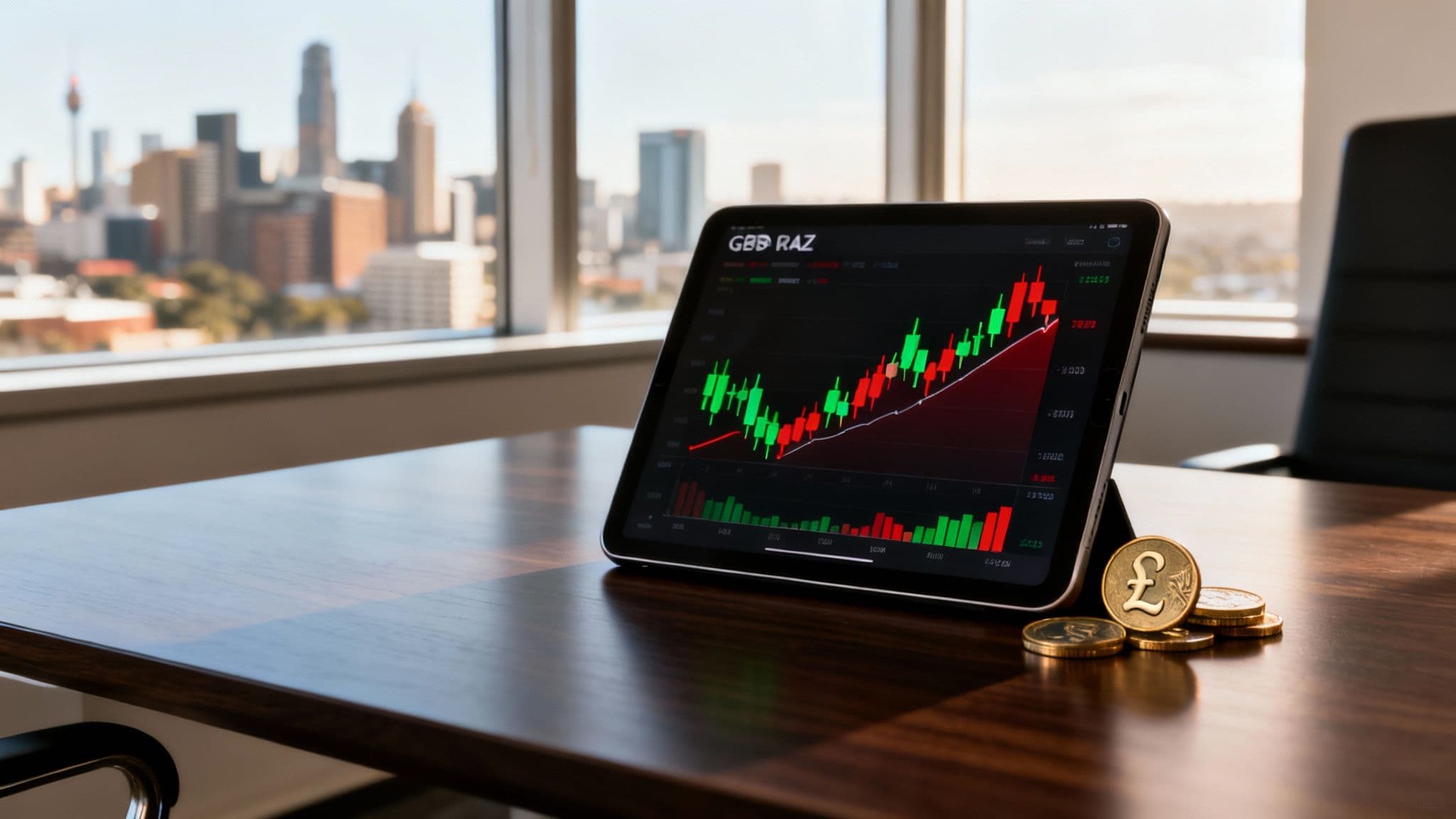
If you're a South African business importing from the UK or getting paid in Pounds, you know the feeling. One day, a £1,000 invoice costs you R23,500. A week later, that same invoice suddenly costs R24,000. These swings aren't random; they're the story of two economies interacting in real-time. The GBP/ZAR exchange rate graph turns this complex financial story into a picture you can actually understand and use.
It’s like putting on a pair of glasses that brings your international transactions into sharp focus. Instead of just guessing when to pay a supplier or convert your earnings, you can start making smart decisions based on trends and patterns you can see for yourself. Getting comfortable with this graph is the first real step to taking control of your foreign exchange risk.
From Confusion to Clarity
This guide is here to cut through the noise. We're going to walk you through how to read these graphs, step-by-step, moving from the basic building blocks to real, practical strategies you can apply to your business.
Our goal is simple: to give you the confidence to:
- Understand the core parts of any currency graph without needing an economics degree.
- Spot the trends that show whether the Rand is getting stronger or weaker against the Pound.
- Time your payments to get more Rand for your Pound (or pay less Rand for your invoice).
- Manage your financial risk by seeing how the market has behaved in the past.
By the time you're done, you'll look at the GBP/ZAR graph not as something confusing, but as an essential tool for making smarter, more profitable decisions. Let's start decoding the story it has to tell.
Understanding Price Volatility and Spreads
Before you can start spotting trends on a GBP/ZAR graph, you need to get a feel for what those movements actually mean. Think of that fluctuating line as the heartbeat of the two economies; its rhythm tells a clear story of strength, weakness, and the hidden costs baked into your international transactions.
Let's break down what you're seeing, without the financial jargon.
At its most basic, the price on the graph is simply the cost to swap one currency for the other. If you're running a South African business, it’s the number of rands you need to buy one British pound right now. When that graph ticks upwards, the pound is getting stronger, and your rands are buying you less.
The Hidden Cost: The Bid-Ask Spread
But here’s something most simple graphs don’t show you: there isn't just one price. In the real market, there are always two prices at any given moment—a price to buy (the ask) and a price to sell (the bid). The gap between them is the bid-ask spread.
Think of it like a fruit vendor at a market buying mangoes for R10 and selling them for R12. That R2 difference is their profit. The bid-ask spread is exactly the same principle; it's the fee the bank or payment provider charges for handling the exchange. A wider spread means you're paying a bigger hidden fee.
For businesses making frequent or large-value payments, this spread can quietly erode your profits, adding up to thousands of rands over a year. A major goal for any South African company dealing in forex is to find a provider with the narrowest spread possible.
This is often where traditional banks make a significant chunk of their money on international payments. It’s a cost that isn't always laid out clearly, but it hits your bottom line every single time you convert currency.
What Is Price Volatility?
Finally, we have volatility. This is just a word to describe how much and how fast the exchange rate is jumping around. Picture the difference between a calm, placid dam and the choppy, unpredictable open ocean.
Low Volatility: The graph looks more like a gentle, rolling hill. The rate is stable, which makes it far easier to forecast your costs and plan your payments with some certainty.
High Volatility: The graph looks like a dramatic mountain range, full of sharp peaks and deep troughs. This signals rapid, big price swings, which creates both risk and opportunity.
For a South African exporter getting paid in pounds, high volatility is a double-edged sword. A sudden spike in the GBP/ZAR rate is great news—your pounds will suddenly convert into a lot more rands. But a sharp drop can wipe out your profit margin in an instant. Watching the volatility on the graph is your key to managing this financial risk.
How to Read Different Chart Types and Timeframes
Staring at a GBP/ZAR exchange rate graph for the first time can feel a bit like trying to decipher a secret code. But once you know what to look for, you’ll see that different charts are just telling the same story in different ways.
The two you’ll see most often are line charts and candlestick charts. Picking the right one depends entirely on how much detail you need to make a smart decision for your business.
This concept map breaks down the key terms you'll encounter on any currency graph, from the price itself to the spread and the market's volatility.
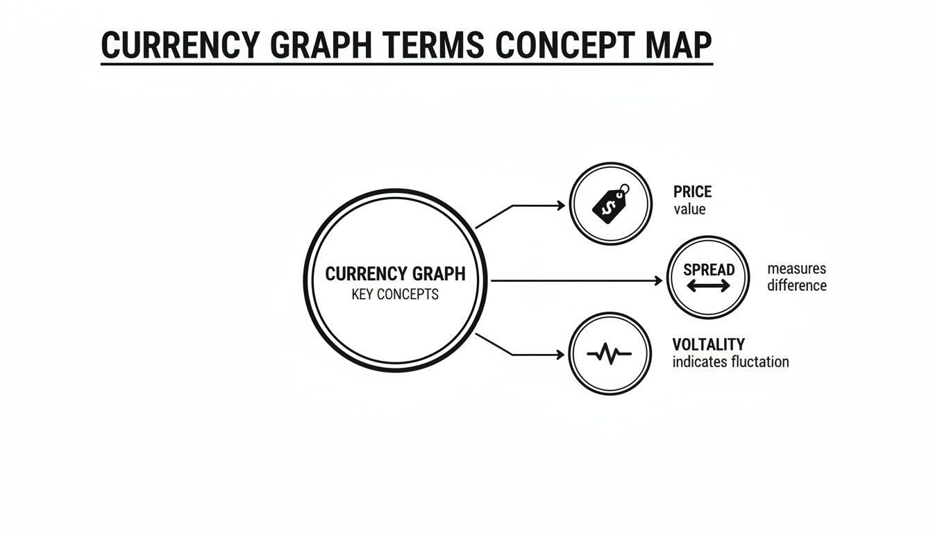
Think of these three elements—price, spread, and volatility—as the fundamental building blocks of information. Together, they help you understand not just the cost of a transaction but also the risk involved.
The Simple Line Chart
A line chart is the simplest storyteller. It just connects a series of closing prices over a set period, drawing one clear, continuous line. It’s clean and easy to read.
So, what does it show? The big picture. It quickly tells you the general direction of the GBP/ZAR rate. Is the Pound getting stronger or weaker against the Rand over the long haul?
It’s perfect for getting a quick overview without getting bogged down in the day-to-day market noise. This is your go-to for strategic planning, not for timing a payment down to the minute.
The Detailed Candlestick Chart
If a line chart is the summary, a candlestick chart is the full chapter. It gives you a much richer, more detailed view of what happened in the market during a specific period.
Each 'candle' represents a set timeframe—like an hour or a day—and tells a complete story of the tug-of-war between buyers and sellers. A single candle shows four key data points: the opening price, the closing price, the highest price, and the lowest price.
The thick part, or 'body', shows the range between the open and close, while the thin 'wicks' show the highs and lows reached.
For a business managing cross-border payments, this detail is incredibly useful. A long green candle might signal strong upward momentum for the Pound, suggesting it could get more expensive. A long red candle, on the other hand, shows the opposite, potentially highlighting a good window to pay that UK supplier.
Choosing the Right Chart for Your Needs
Deciding between a line and a candlestick chart comes down to what you're trying to achieve. One gives you a quick snapshot for strategic planning, while the other provides the granular detail needed for timing your transactions. This table breaks it down.
| Chart Type | Best For | Key Advantage | Potential Drawback |
|---|---|---|---|
| Line Chart | Spotting long-term trends and getting a quick overview. | Simple, clear, and excellent for seeing the big picture. | Lacks detail on intra-day price movements and volatility. |
| Candlestick Chart | Analysing short-term price action and market sentiment. | Provides four data points (open, high, low, close) in one. | Can be visually overwhelming for beginners; may lead to over-analysis. |
Ultimately, many professionals use both. They'll start with a line chart to understand the overall trend and then switch to a candlestick chart to drill down into the details when it's time to act.
Choosing the Right Timeframe
Just as important as the type of chart is the timeframe you select. Think of it like zooming in or out with a camera lens—what you see changes dramatically depending on your perspective.
- Short Timeframes (e.g., 1-hour, 4-hour): These are for tactical, here-and-now decisions. If you need to pay a UK invoice today, an hourly chart can help you spot a temporary dip in the Pound's value to secure a slightly better rate. It's all about immediate timing.
- Long Timeframes (e.g., daily, weekly, monthly): These are for your strategic planning hat. A one-year chart helps you identify major, long-term trends, which is essential for forecasting costs and setting your budget for the months ahead.
Your goal dictates your timeframe. Are you making an urgent payment, or are you trying to understand the economic landscape for your next financial quarter? The most complete picture of the GBP/ZAR exchange rate comes from blending both short-term views for action and long-term views for strategy.
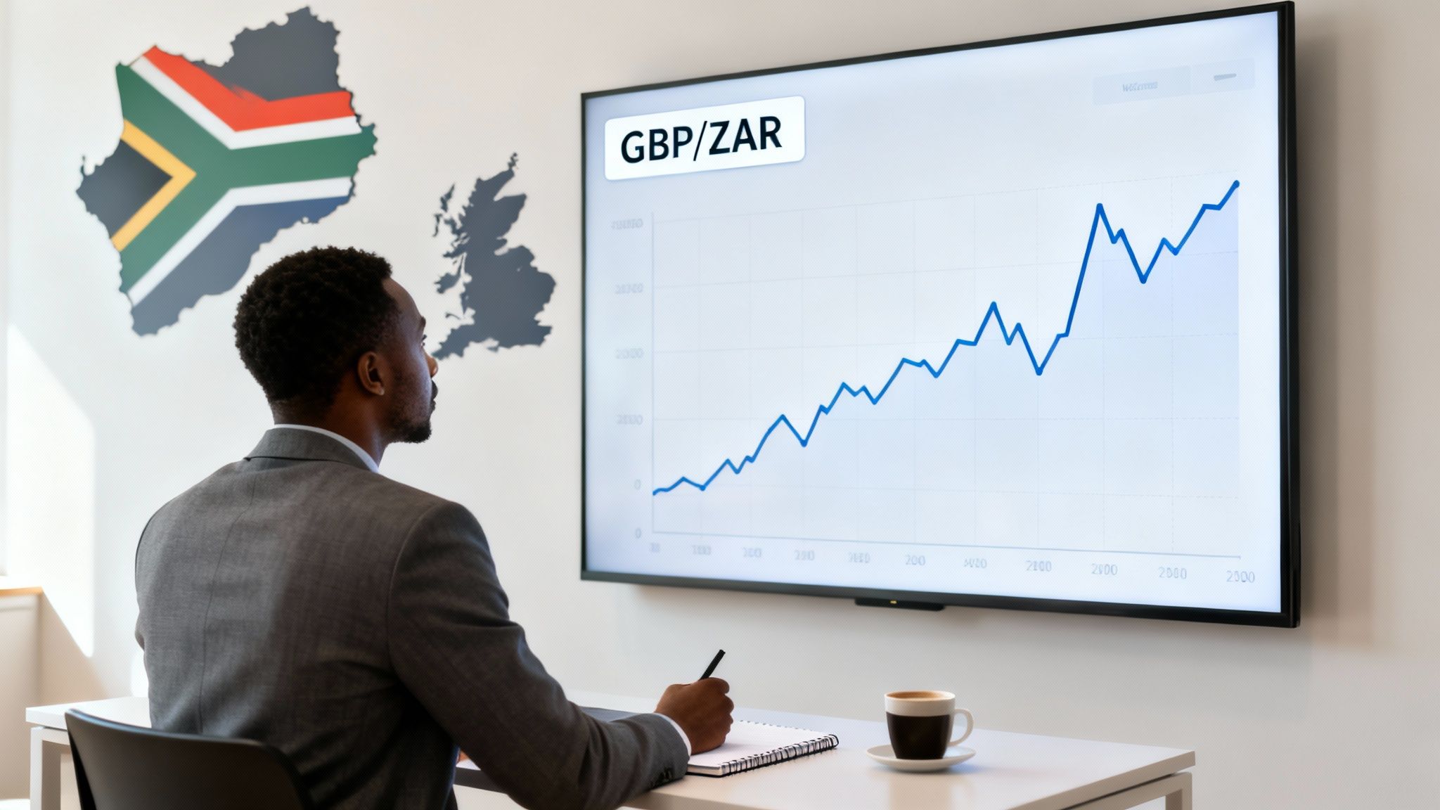
Reading the Story in the GBP/ZAR Graph: Trends & Historical Patterns
A GBP/ZAR exchange rate graph is so much more than a line on a screen. Think of it as a history book, charting the economic relationship between the UK and South Africa. When you learn to read that story, you stop reacting to market swings and start anticipating them. Historical patterns give you the context to understand why the market is moving and where it might be headed next.
Those peaks and valleys aren't just random noise. They’re the direct result of real-world events that rattle investor confidence and shift currency values. For a South African business, being able to connect a sudden spike on the graph to a news headline is an incredibly powerful skill.
Connecting Market Moves to Real-World Events
The dance between the Pound and the Rand never stops, pushed and pulled by the latest economic and political news from both the UK and South Africa. A sharp, sudden move on the graph is almost always a direct reaction to a major event.
By looking back at periods of high volatility, you can start to see cause-and-effect relationships that tend to repeat.
- Political Announcements: Big elections or major policy changes can inject a huge dose of uncertainty into the market. Think about the lead-up to a South African election—investor caution can easily weaken the Rand.
- Interest Rate Decisions: When the Bank of England raises interest rates, holding Pounds becomes more attractive for investors, often causing the GBP/ZAR rate to climb. The same is true in reverse when the South African Reserve Bank makes a move.
- Economic Data Releases: Reports on inflation, unemployment, or GDP are like a regular health check-up for an economy. A surprisingly strong UK jobs report can give the Pound a boost, making your UK imports more expensive almost overnight.
Getting a feel for these connections is what it’s all about. It helps you understand that a rate jumping from 23.75 to over 24.00 ZAR isn't just a number—it’s the market digesting and reacting to real economic pressures.
Spotting Long-Term Depreciation Trends
Now, zoom out. Look at the GBP/ZAR graph over one, three, or even five years. A bigger, clearer trend often comes into focus. For most South African businesses, this has been the slow, gradual depreciation of the Rand against major currencies like the Pound. This isn't a short-term blip; it's a persistent pattern driven by deeper economic realities.
This long-term weakening of the Rand is a critical piece of the puzzle for any strategic planning. It tells you that, over time, the cost of paying a UK supplier in Pounds is more likely to go up than down. Acknowledging this reality is the first step in smart, long-range financial planning.
We’ve seen a clear example of this play out recently. Looking at the graph from a South African perspective, the Rand’s slide against the Pound is hard to miss. In the 180 days leading up to September, the rate bounced between 23.5 and 24 ZAR, but the bigger picture shows the Rand lost about 5% of its value against the Pound. This was driven in part by political uncertainty following local elections. You can explore more historical data on recent GBP/ZAR movements to see these patterns for yourself.
When you can spot these long-term trends, you can build a far more resilient financial strategy for your business, preparing for future costs instead of just being surprised by them.
A Practical Guide to Timing Your International Payments
Knowing what the charts have done is one thing. Turning that knowledge into action is what really protects your bottom line. Timing your payments using the GBP/ZAR exchange rate graph isn’t about gazing into a crystal ball; it’s about following a simple, repeatable process to manage your risk and spot opportunities.
This isn't about becoming a currency trader overnight. It's about moving from being a passive price-taker to someone who proactively manages their foreign exchange exposure. You’re simply making smarter decisions based on the data right in front of you.
A Three-Step Framework for Timing Payments
Let's break down how to turn chart-watching into a practical workflow. This straightforward approach will help you decide when to hit 'send' on your international transfers.
Identify the Long-Term Trend: First, zoom out. Look at a 6-month or 1-year chart. Is the Rand generally getting weaker or stronger against the Pound? This gives you the big picture. If the trend shows a weakening Rand, for example, waiting to pay a bill in Pounds could mean it gets more expensive each week.
Analyse Short-Term Volatility: Now, zoom in to a daily or weekly chart. Look for the recent peaks and troughs—the rhythm of the market. Your goal here is to find a better entry point within that broader trend. It might mean waiting for a small dip during the day to pay that UK supplier, which gets you more Pounds for your Rands.
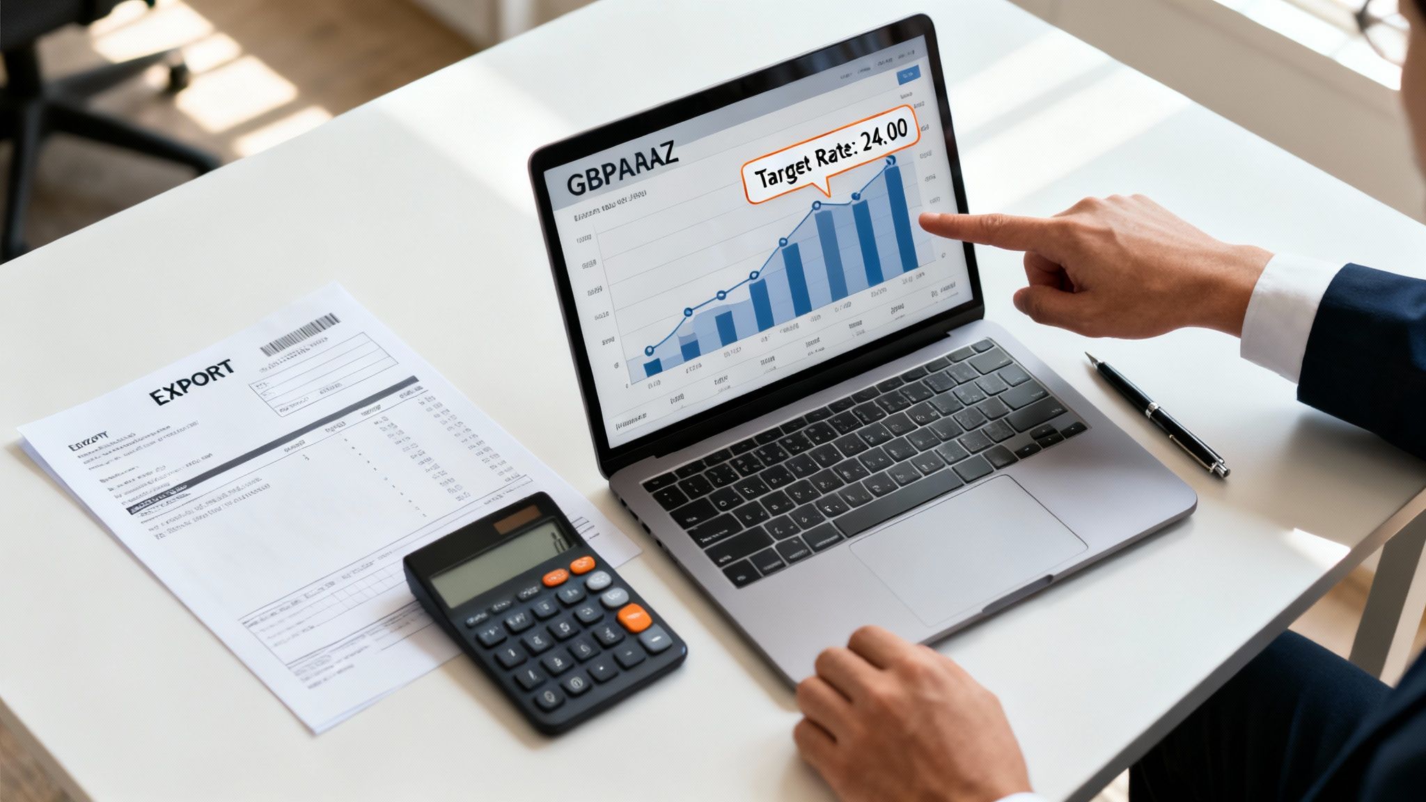
Set Your Target Rate: Based on what you see and what your budget needs, pick a specific exchange rate you’d be happy with. It could be a "good enough" rate that locks in your profit margin or an "ideal" rate you hope to catch if the market moves in your favour.
This methodical process pulls the guesswork and emotion out of the equation. Instead of reacting to scary news headlines, you’re acting on a plan based on actual market behaviour—a cornerstone of good financial risk management.
An Exporter’s Scenario
Let's make this real. Imagine a South African business that needs to bring £10,000 in sales revenue back home into Rands. The owner has seen the long-term trend of Rand weakness but notices on the daily chart that the rate often dips slightly after a sharp spike.
Instead of taking today's rate of 23.95 ZAR, they set a target rate of 24.10 ZAR and decide to wait. If the market hits their target, that tiny difference of 15 cents per Pound adds up. On that single transaction, they’ve just made an extra R1,500. That’s the real-world value of timing your payments.
For businesses managing these kinds of payments often, having access to specialized customer support for financial services can also be a huge help in streamlining operations and getting queries sorted quickly.
Even the smallest movements matter. For instance, recent data showed the GBP/ZAR rate swinging between 22.5115 and 22.7541 in just one week. A spike on December 8 pushed the cost of £100 from around R2,250 to R2,260 overnight, showing just how much these tiny shifts can impact your costs.
Bringing It All Together: Your Forex Game Plan
We’ve walked through how to read and use the GBP/ZAR exchange rate graph, and hopefully, you can see it’s not just a tool for professional traders. For any South African business sending or receiving pounds, it's an essential piece of kit. Moving from being at the mercy of currency swings to actively managing your forex exposure all comes down to a few key steps.
It all begins with getting comfortable with the basics: what the graph shows, which chart type and timeframe suit you best, and how to spot recurring patterns. Once you have that foundation, you can start timing your payments with a lot more confidence.
A Practical Checklist for Your Business
Looking back, the historical GBP/ZAR exchange rate graph tells a stark story of long-term Rand depreciation. If you dig into the data from the South African Reserve Bank, you'll see that back in the 1980s, the rate was under 1 ZAR per GBP. Today, it’s hovering at a multiplier of over 22x.
That’s a massive 2,200% loss in the Rand's value over a few decades, fuelled by everything from apartheid-era sanctions to the economic shifts of post-1994 global integration. This bigger picture really drives home why being proactive is so crucial.
The real goal here is to build a smarter currency strategy for your business. It’s about moving from simply reacting to market news to making informed decisions based on what the data is showing you.
Ready to put this into practice? Here’s a simple checklist to get you started:
- Look back at past transactions: How much have currency fluctuations actually cost your business over the last year?
- Start a weekly check-in: Pull up the daily graph once a week. Just observe. Get a feel for its rhythm and patterns.
- Set a target for your next big payment: Turn your newfound knowledge into a concrete goal. Decide on a rate you'd be happy with and plan around it.
Common Questions About the GBP/ZAR Graph
Even with a solid grasp of the basics, a few practical questions always come up when people start using these charts. Let's tackle some of the most common ones.
What Is the Best Timeframe to Use?
Honestly, there's no single magic timeframe. The right one for you depends entirely on what you're trying to achieve.
If you’re doing long-term financial planning—say, budgeting for an import shipment arriving next quarter—a daily or weekly chart is your best friend. It cuts through the day-to-day chatter and shows you the bigger picture. But if you need to pay an invoice this week, a 1-hour or 4-hour chart gives you the close-up view needed to find a decent intraday rate.
How Can I Predict Where the Rate Will Go Next?
This is the big one, and the honest answer is: you can't, not with 100% certainty. Anyone who tells you otherwise is selling something. The point of using a GBP/ZAR exchange rate graph isn't about having a crystal ball; it's about making smarter, more informed decisions based on the evidence in front of you.
When you learn to spot support and resistance levels—those historical floors and ceilings we talked about—you can make an educated guess about where the rate might bounce or stall. This isn't predicting the future; it's just good risk management.
Why Does the Rate on the Graph Differ From My Bank’s Rate?
Great question. The rate you see on a standard financial graph is the mid-market rate. Think of it as the 'wholesale' price of the currency, sitting exactly halfway between what buyers are willing to pay and what sellers are asking for on the global market.
Your bank, on the other hand, isn't giving you that rate. They add their own markup, or spread.
This is how they make their profit. The rate they offer you is always going to be less favourable than the mid-market rate you see on the chart. That gap is why shopping around for a provider who offers rates closer to the real thing is so critical.
Stop losing money to hidden fees and unpredictable bank rates. With Zaro, you get access to the real exchange rate with zero spread, ensuring your business receives the full value of every transaction. See how much you can save on your next international payment. Learn more at usezaro.com.